Santander
Interaction Design, User Interface design
Project
Details
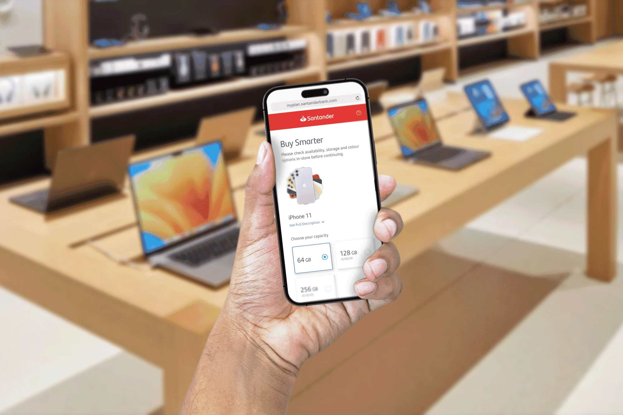
This case study unveils the meticulous journey of crafting this mobile platform, from dissecting user needs to meticulously perfecting the user flow, ultimately culminating in a seamless and empowering purchasing experience that cemented Santander's strategic partnership with Apple. Buckle up, as we delve into the intricate world of UX design and witness the birth of a business triumph.
Imagine the scene: You're bathed in the cool, blue glow of the Apple Store, surrounded by sleek gadgets whispering promises of a faster, better you. Your eyes land on the latest iPhone, its shimmering screen reflecting your longing desire. But then, reality bites. Your wallet, tucked snugly in your pocket, murmurs sweet nothings about bills and rent. It's the same story with your trusty MacBook – it's starting to sputter and cough, begging for an upgrade, but your budget stubbornly shakes its head.
This familiar struggle was the golden opportunity that Santander, the financial powerhouse, saw when they approached Apple. They envisioned a partnership that would bridge the gap between yearning and owning, making those shiny gadgets not just objects of desire, but attainable rewards. The key? Flexible financial plans, tailored to fit any budget, turning that longing stare into a triumphant "add to cart" click.
Goals
Designing a mobile platform, seamlessly accessible via QR codes within Apple stores, that empowers customers to customize and acquire their desired devices through flexible financial plans. This innovative approach aimed to simultaneously drive Apple sales for Santander while significantly enhancing affordability and purchase convenience for tech-savvy consumers. So it should achieve the following aspects:
- Convenient purchasing process: Customers need a simple and effortless way to purchase products in the Apple store.
- Time-efficient browsing: They require a quick and efficient way to browse and customize products that meet their needs.
- Flexible financial plans: Customers need options to split the costs into monthly payments to manage their budgets.
- Clear upgrade path: They desire an easy way to stay up-to-date with the latest products.
- Seamless integration with existing devices: Customers need smooth integration between new and existing devices for a seamless user experience.
The result? A checkout experience so smooth it felt like butter. We ditched the labyrinthine queues and confusing paperwork, crafting a digital haven where customizing and purchasing your dream tech was a breeze. Gone were the days of sticker shock and budgetary anxieties; our awesome financial plan sliced the cost into bite-sized monthly treats, letting you savor your new gadget without financial indigestion. This wasn't just a platform; it was a portal to techie nirvana, a one-stop shop for your Apple obsessions, leaving you smiling brighter than the screens you just bought.
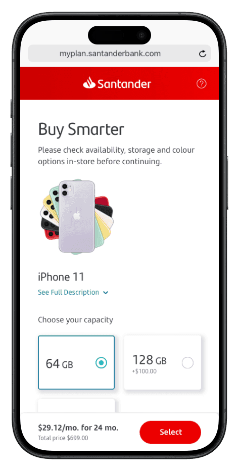
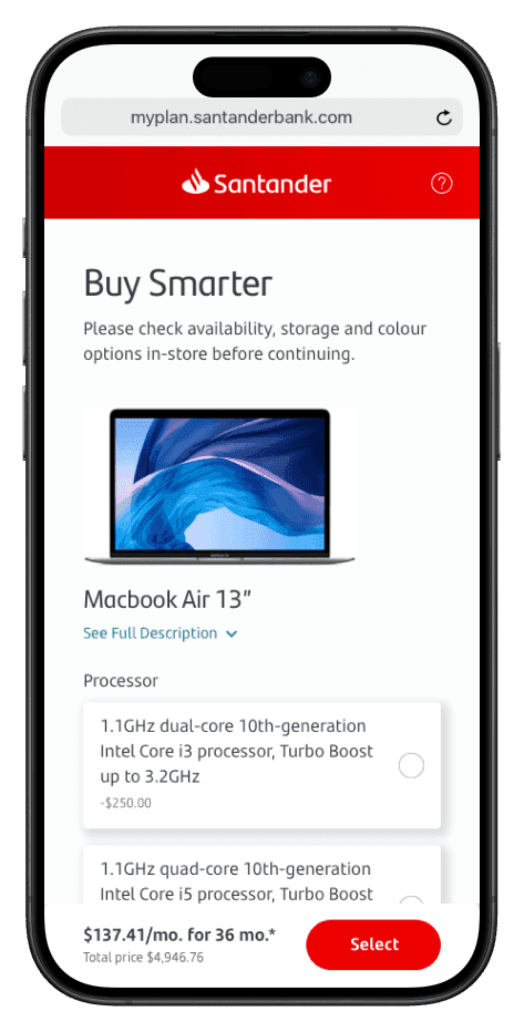
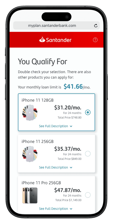
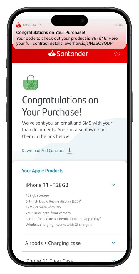
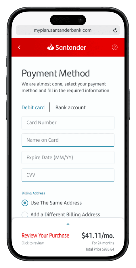
Before delving into designing the platform, we conducted a brief desk-research to understand Apple's customer behavior inside an Apple Store. This research included analyzing customer reviews, observing user behavior in stores, and studying existing literature on Apple's retail experience. This research served as a crucial foundation for identifying the specific needs and pain points of Apple customers during the purchase process. By understanding their motivations, frustrations, and preferences within the Apple environment, we were able to tailor the platform design to provide a truly seamless and user-centric experience.
- Convenient purchasing process: Customers need a simple and effortless way to purchase products in the Apple store.
- Time-efficient browsing: They require a quick and efficient way to browse and customize products that meet their needs.
- Flexible financial plans: Customers need options to split the costs into monthly payments to manage their budgets.
- Clear upgrade path: They desire an easy way to stay up-to-date with the latest products.
- Seamless integration with existing devices: Customers need smooth integration between new and existing devices for a seamless user experience.
With a clear understanding of the business requirements and design system, we meticulously crafted a user flow that mapped out the entire purchase journey within the platform. This flow meticulously documented each step a user would take, from browsing and customizing products to finalizing their purchase and activating their financial plan. We meticulously examined each step, ensuring a smooth and intuitive progression that minimized friction and confusion. Additionally, we developed a comprehensive information architecture that organized all product information, financial plan details, and support resources in a logical and easily accessible manner.
User Flow and Information Architecture:
With a clear understanding of the business requirements and design system, we meticulously crafted a user flow that mapped out the entire purchase journey within the platform. This flow meticulously documented each step a user would take, from browsing and customizing products to finalizing their purchase and activating their financial plan. We meticulously examined each step, ensuring a smooth and intuitive progression that minimized friction and confusion. Additionally, we developed a comprehensive information architecture that organized all product information, financial plan details, and support resources in a logical and easily accessible manner.
Next project
Ask Markerr
View case study